Kerning in Typography - اردو / हिंदी`
By GFXMentor
This is an AI-generated summary of “Kerning in Typography - اردو / हिंदी`” — a 11 min YouTube video by GFXMentor, published November 15, 2021. It condenses the full transcript into 10 key takeaways with clickable timestamps.
Summary
The video explains why kerning is crucial for typography, how to use auto, optical, and manual settings in design software, and offers practice tips to improve visual spacing.
Key Points
- Tracking controls overall character spacing, while kerning fine‑tunes the gap between two letters.
- Kerning adjusts the spacing between specific pairs of characters and can make a design look professional or immature.
- Kerning should be applied mainly to titles, headings, logos, or wordmarks, not to full body copy.
- Consistently applying thoughtful kerning to titles and wordmarks elevates the overall quality of a design.
- Illustrator and Photoshop provide auto, optical, and zero kerning options, with optical generally giving the best results.
- To manually adjust kerning, place the cursor between two characters and use the plus/minus controls or scroll the mouse wheel.
- Capital letters, especially when using All Caps, often need additional kerning adjustments because gaps become more noticeable.
- After setting a text block to optical kerning, fine‑tune problematic pairs by increasing or decreasing their values as needed.
- Uneven visual gaps often arise from the font’s design and require manual correction for a balanced look.
- Practicing with tools like method.ac’s “Kern Me” game helps develop an eye for proper spacing.
Summarize any YouTube video, free
You just read an AI summary of this video. Paste any other YouTube link and get the key points with clickable timestamps in seconds — no signup, 5 free a day.
More Resources
More Summaries
 12 min
Best Instagram Marketing Strategy For Small Business 2026 (PROVEN & PROFITABLE)
The video explains that Instagram success now hinges on building an authentic personal brand that creates trust, using a five-step Human Framework rather than outdated algorithm hacks.
 26 min
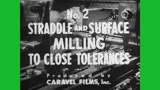
Surface and Straddle Milling with Precision
The video explains how to precisely mill a T‑shaped part from hot‑rolled steel, detailing setup, cleaning, calculations, test cuts, and adjustments to achieve ±0.002‑inch tolerances.
 29 min
Rande Gerber Despised His Own Son Presley Gerber - The REAL Reason Is SHOCKING
The video explores the tragic life and death of Presley Gerber, a young model and son of celebrities Cindy Crawford and Randy Gerber, highlighting his struggles with mental health, addiction, and the
 45 min
[International Trade] WEEK4(3)
This lecture explains the concept of opportunity cost and its crucial role in understanding comparative advantage and international trade, demonstrating how specialization based on lower opportunity c
 25 min
[International Trade] WEEK4(2)
The video explains absolute and comparative advantage, shows how opportunity costs determine specialization, and demonstrates how mutually beneficial trade increases total output.